Good Growth Foundation


The Good Growth Foundation are a political think-tank who are campaigning for a fairer economy, so growth can work for good. Following a decade of stagnation, the Good Growth Foundation is advocating for a new approach, one that prioritises growth that reduces inequality, raises living standards, and creates real opportunities for everyone. Bolter's branding for GGF reflects both the progressive nature of their mission and their commitment to driving tangible, positive change. The vivid colour palette evokes optimism, creativity and action, signalling that a fairer economy is not just possible, but something to be excited about. By using bright hues we aim to communicate hope, growth, and inclusivity—key themes of the Foundation’s work.

CATEGORY

People

SERVICES

Identity + Web Design
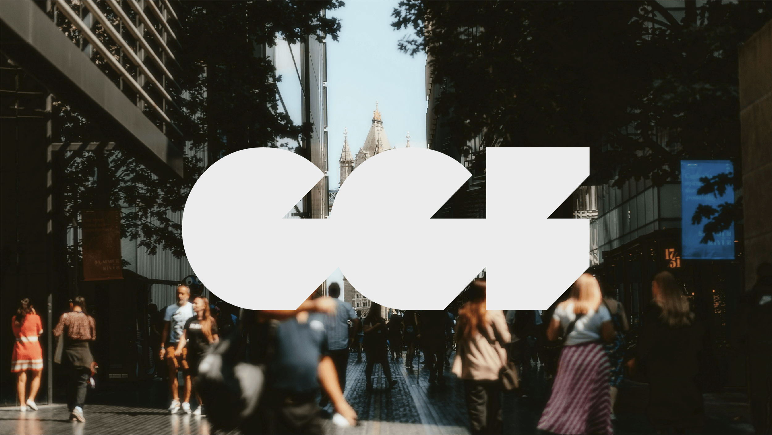
Good Growth Foundation white logo overlaid on a bustling London street scene with Tower Bridge in the distance.
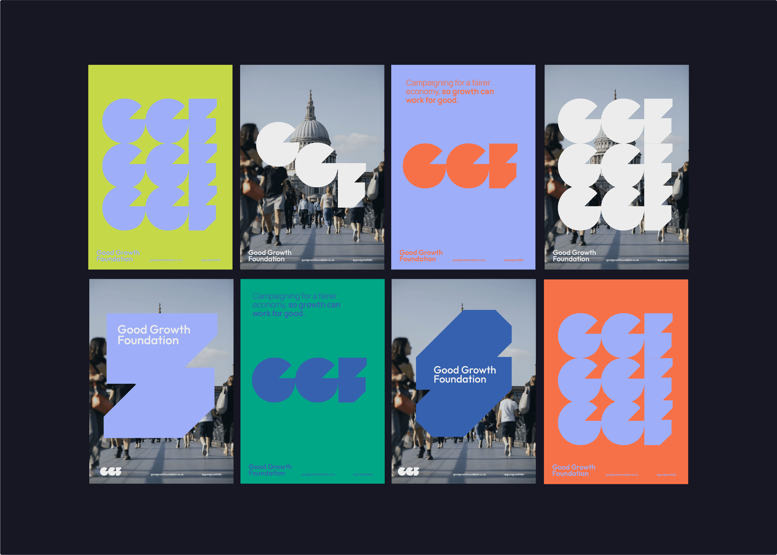
A collection of Good Growth Foundation posters showcasing vibrant brand colours, dynamic graphics, and clean layout.
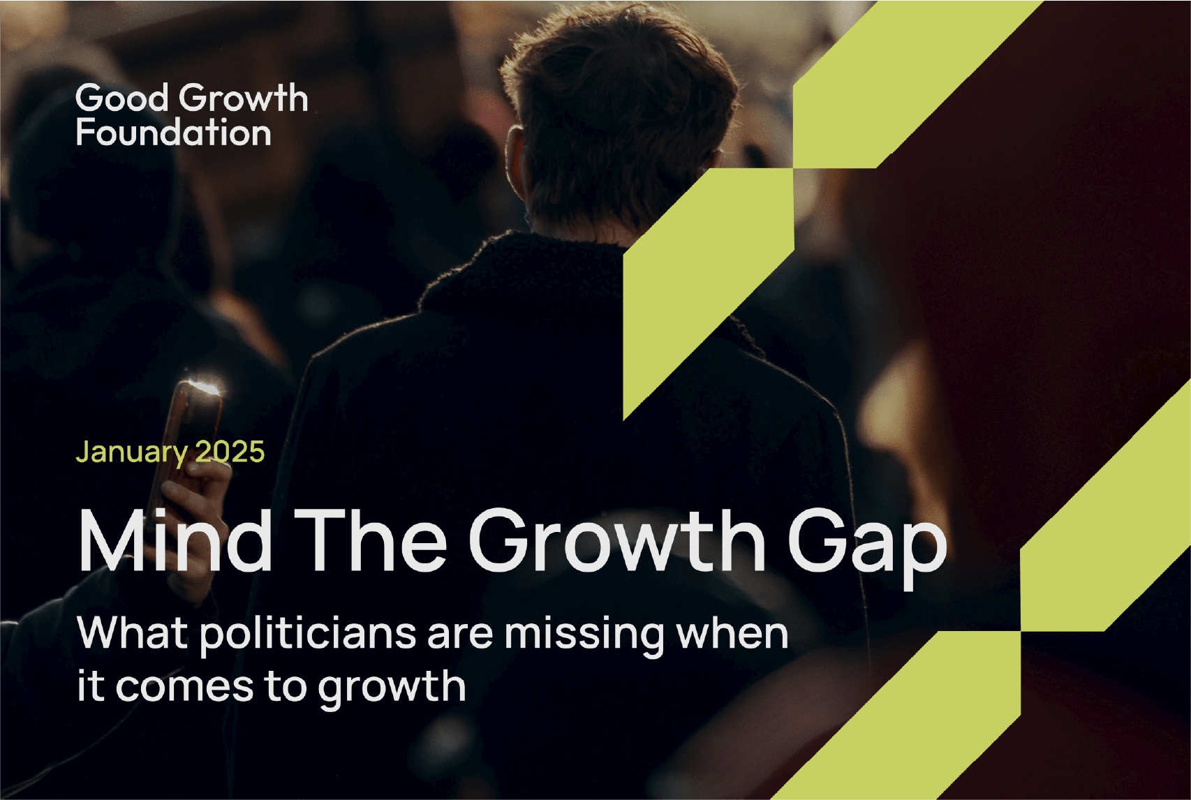
Cover design of the Good Growth Foundation 'Mind the Growth Gap' research report.
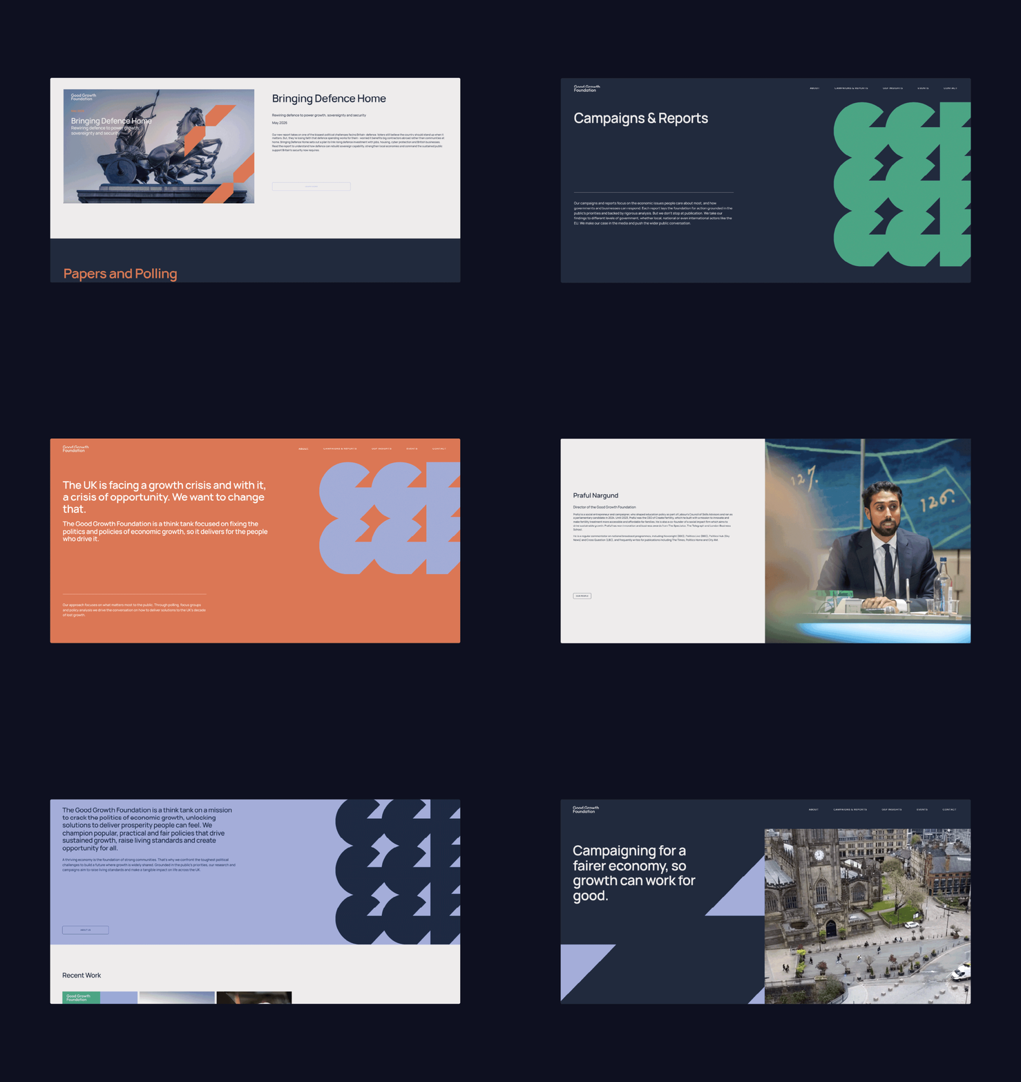
Website UI scrolling animation showcasing the foundation's dynamic graphic assets and vibrant colour palette.
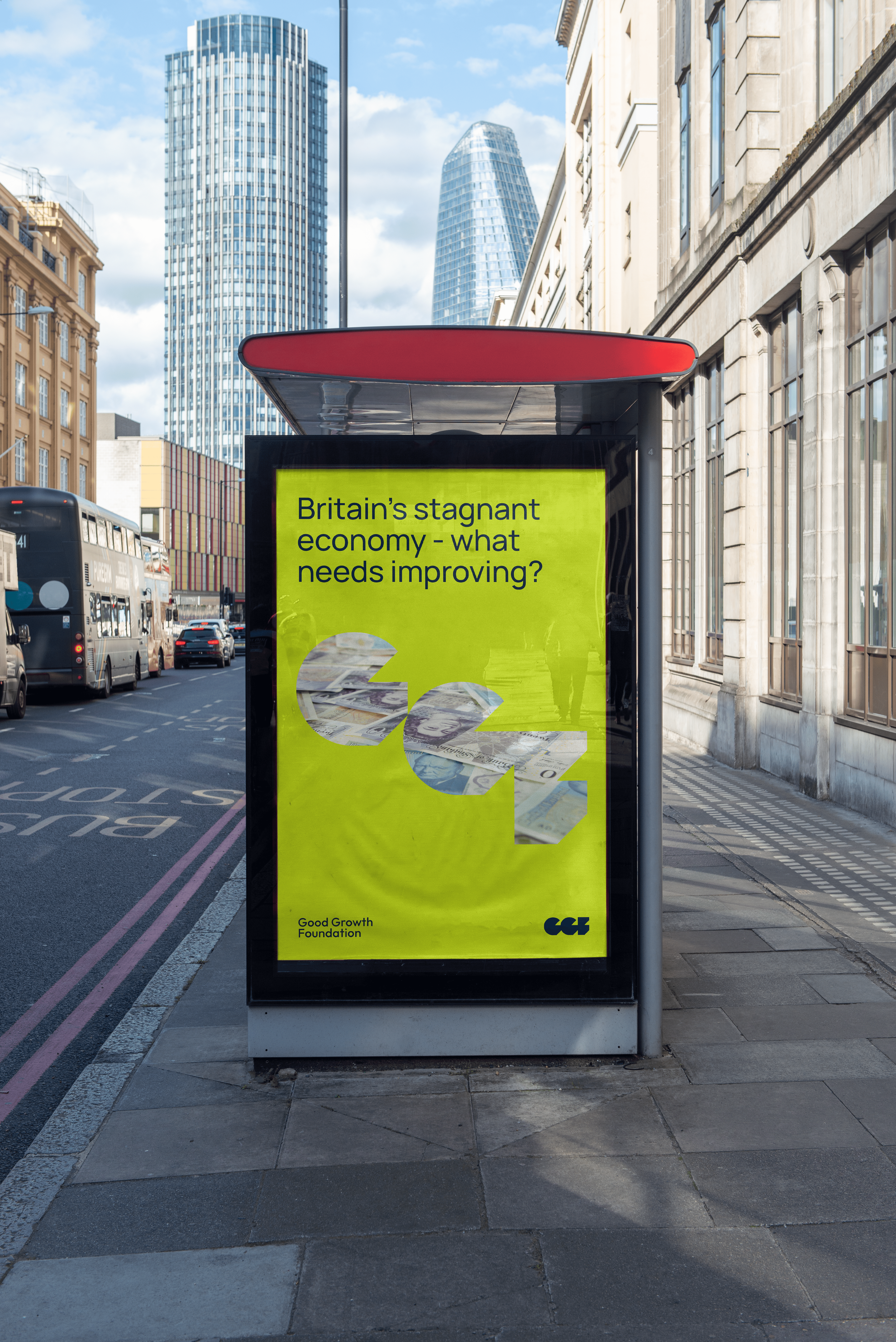
Good Growth Foundation outdoor billboard featuring high-contrast brand colours and clean typography.
A minimalist Good Growth Foundation editorial poster design featuring clean brand typography.
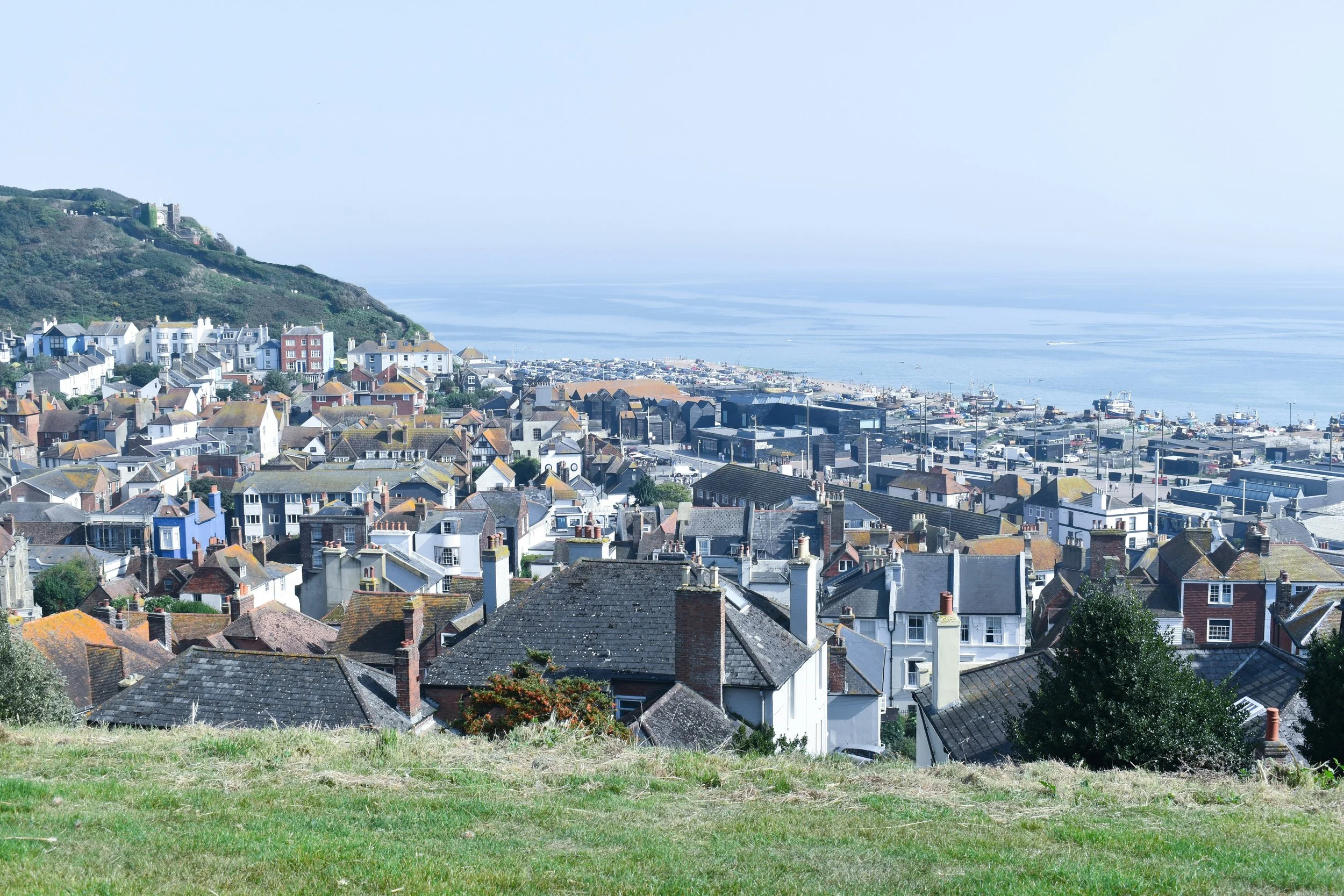
Scenic view overlooking a traditional UK seaside town and coastal landscape.
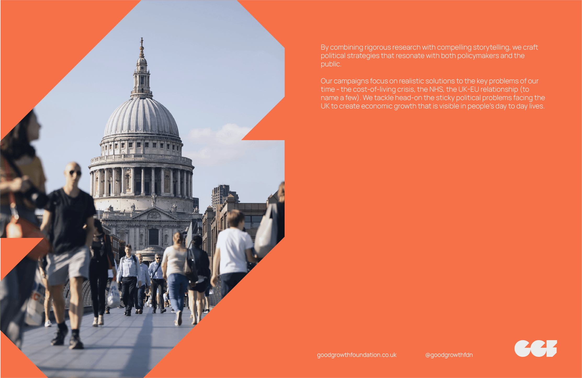
Bright orange Good Growth Foundation poster displaying dynamic graphic shapes and clean typography.
The minimalist Good Growth Foundation wordmark set against a bright lime green backdrop.
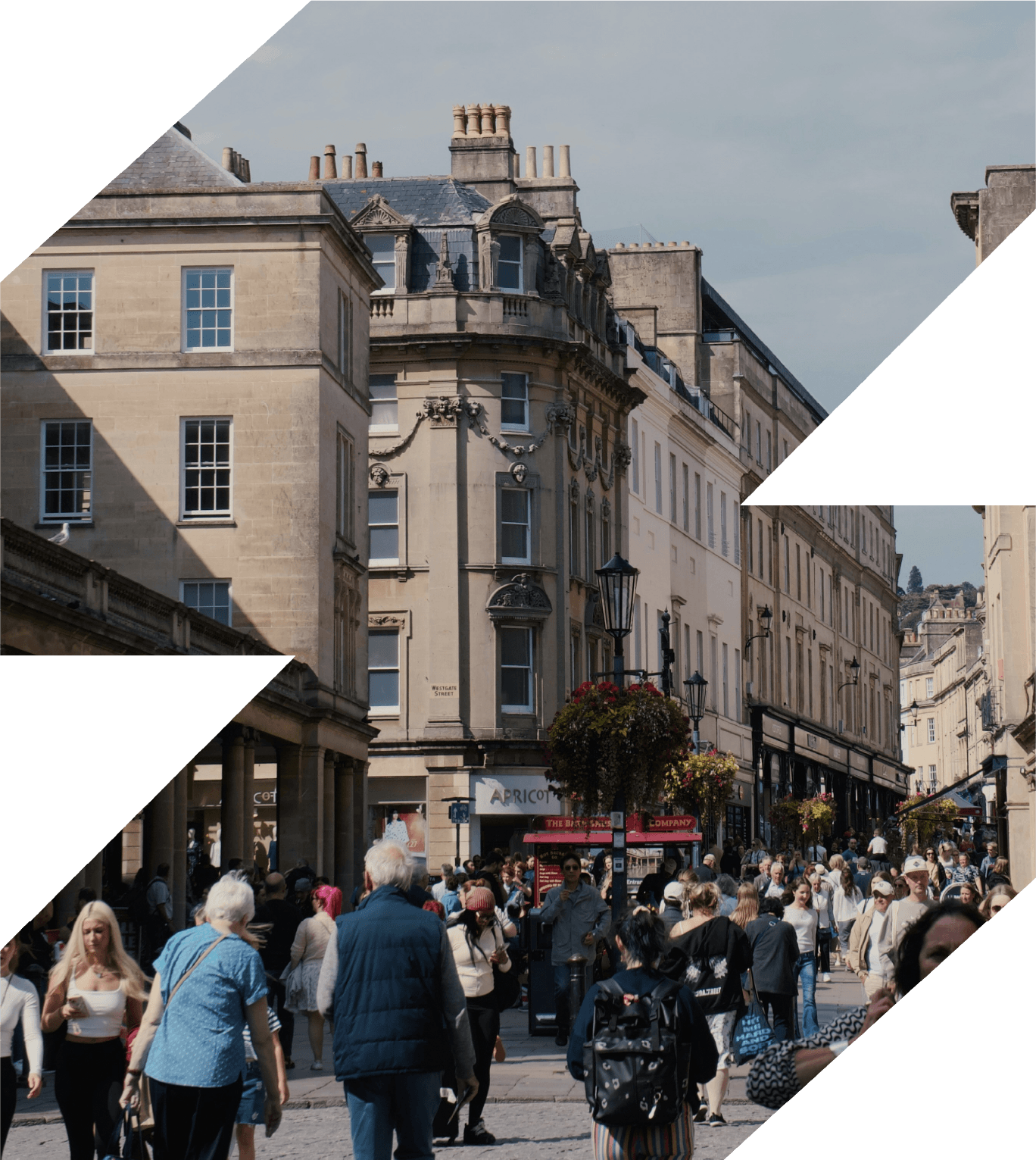
An angular brand graphic frame filled with a documentary photograph of a thriving UK high street.
A bustling UK city street scene featuring an active cyclist, pedestrians, and parked cars.